Volume 2, Issue 7
January 2004
Most do-it-yourself enthusiasts will agree: painting is at once the simplest and most daunting of all home improvement projects. The painting itself is easy; almost anyone can do it. Choosing the perfect color, on the other hand, leaves many reeling in frustration.
“Color is the first thing that strikes a person when they enter a room,
so it’s important that it set the right mood — for the room and its occupants,”
said Home Depot’s Jason Feldman. Case in point, soft, billowy clouds might
inspire one person’s bedroom, while another prefers a passionate, stirring
pink boudoir.
To help select paint colors, Feldman said to begin by jotting down adjectives that describe the look and feel you want to achieve in a particular room. Words like calm, energetic or cozy all evoke emotional responses that will influence your color scheme.
“For example, red stimulates the senses and works well in dining rooms. Golds, yellows and earth tones tend to make rooms feel smaller, more intimate and are a good choice for family rooms and study areas,” he said.
Cool colors like greens, blues and purples tend to soothe and relax the senses, he said, creating a nice backdrop for a bedroom or nursery. They also create an illusion of distance, making them good choices for small rooms.
Also, remember that every component of the room should be considered when choosing your color palette — walls, ceilings, trim, doors and windows. Each plays a distinctive role in the final result.
“Most people think they can’t go wrong with off-whites, but choosing the perfect color scheme for a room is one of the true joys of decorating,” Feldman said. “And, the great thing about taking a chance with wall color is that you can repaint if you don’t like the results.”
Here are a few of Feldman’s color suggestions to get you started:
Pretty In Pink
Chic in 2004, pink hues range from cool mid-toned mauves to warm roses
with just a hint of yellow. Pink is an eye-catching color known for its
exuberance. It is also surprisingly versatile.
“The warmer pink shades, moving towards peach, are definitely in style this year,” said Feldman. “And the deeper, richer rose hue is an elegant partner to chocolate brown. While such grown-up pairings are in vogue for adult spaces, pink is a perennial favorite for girls’ rooms.”
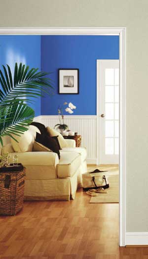
Hues of Blue
From walls to soft furnishings, color trend forecasters predict blue will
continue to grace color palettes this year and for many years to come.
Muted denim tops the list, but shades of green-blue, highly saturated
cobalt and deep, classic navy are all in style, proving that blue is
a hue for all seasons.
Red Rising
For a high impact yet remarkably refreshing look, a dramatic red may be
just what the décor doctor ordered. Considered a “life force” color,
red is multi-cultural and dramatic. From spicy orange-reds to lush blue-reds,
the color is wonderfully adaptable when paired with another shade.
Click here to find a fabric to match any color > InteriorDecorating.com
Fabric Search
New Products


![]() visit InteriorDecorating.com
or call 1-800-590-5844
visit InteriorDecorating.com
or call 1-800-590-5844
P.S. Remember, you can find InteriorDecorating.com fast by using the AOL keyword: InteriorDecorating
